

A Practical Framework to Design, Audit, and Improve Product Onboarding
This framework is meant to work as:
- A creation system
- A UX audit checklist
- A growth optimization reference
- A “double-check before launch” guide
The goal of onboarding is simple:
Help users reach meaningful value with the least possible confusion, friction, and effort.
PART 1 — THE CORE PRINCIPLE
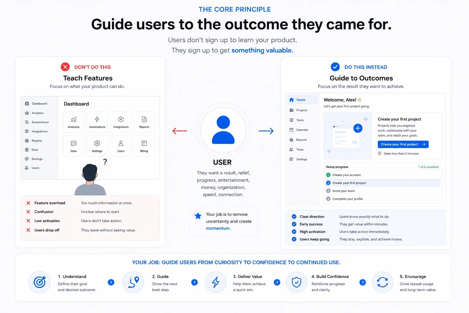
Users do not sign up because they want to learn your product.
They sign up because they want:
a result, relief, progress, entertainment, money, organization, speed, connection
Your onboarding should not teach features.
It should guide users toward their desired outcome.
PART 2 — THE ONBOARDING FLOW FRAMEWORK
Step 1 — Clarify the User’s Desired Outcome
Before designing anything, define:
| Question | Example |
|---|---|
| Why did the user sign up? | “Track expenses automatically” |
| What is their first success moment? | First expense categorized correctly |
| What creates confidence? | Seeing analytics update instantly |
| What creates habit? | Returning daily to log expenses |
Checklist
- The core user goal is clear
- The “aha moment” is defined
- The onboarding focuses on outcomes, not features
- The first value can happen quickly
Step 2 — Reduce Signup Friction
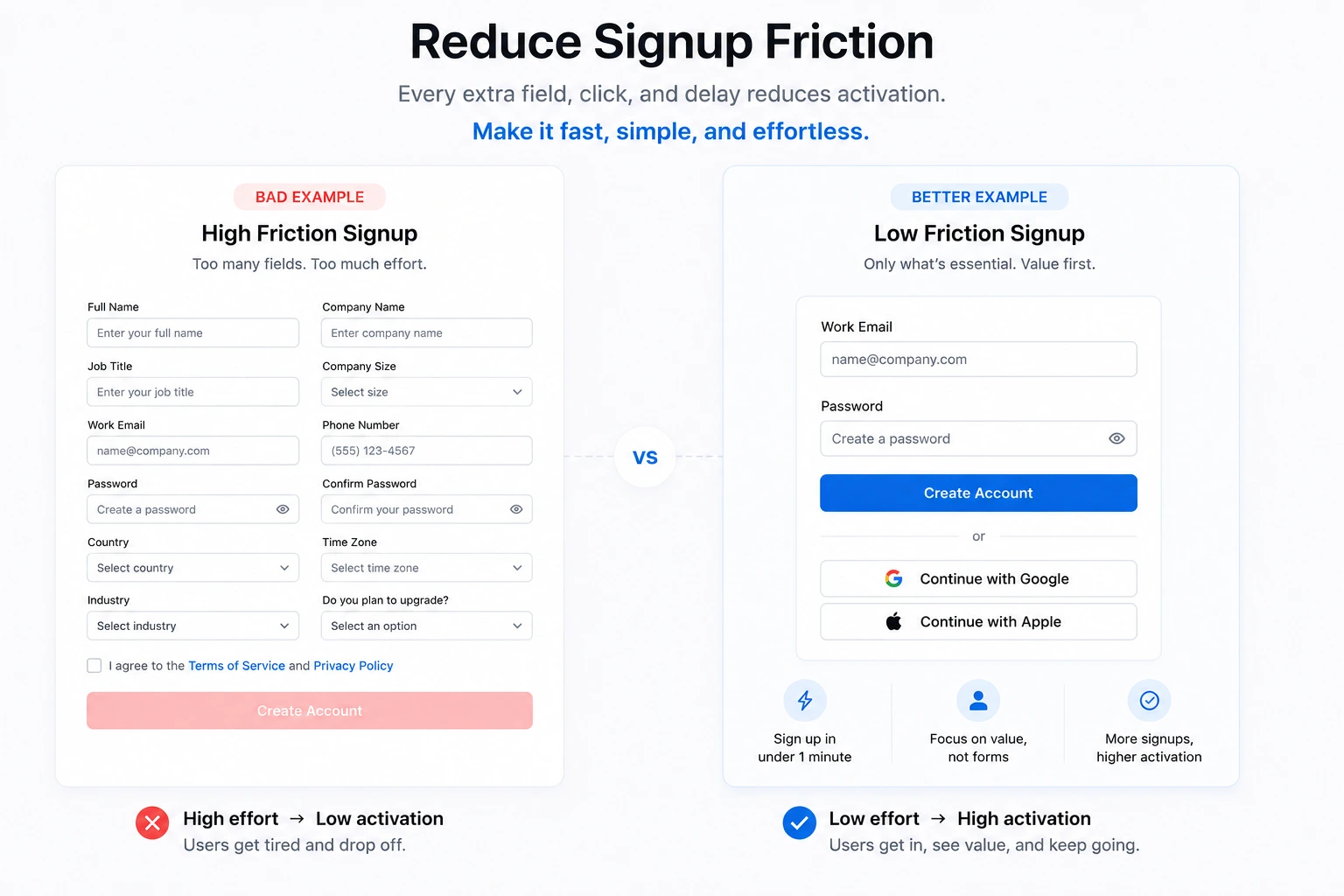
Every field, click, and delay reduces activation.
Good onboarding protects momentum.
Rules
- Ask only essential information
- Use social login when possible
- Delay unnecessary setup
- Avoid long forms
- Remove cognitive overload
Bad Example
- 14 required fields before entering the app
Better Example
- Email + password → immediate access
Friction Audit Checklist
- Can signup happen in under 1 minute?
- Is every field necessary?
- Can some questions be delayed?
- Is login simple on mobile?
- Is there unnecessary verification?
Step 3 — Understand User Intent Early
Different users need different onboarding.
A beginner and an expert should not see the same experience.
Better onboarding questions
- “What do you want to accomplish today?” → personalize the dashboard immediately
- “What best describes your role?” → adapt tools for marketers, developers, managers, etc.
- “How experienced are you with this type of product?” → simplify onboarding for beginners
- “Are you using this alone or with a team?” → prioritize collaboration features if needed
This allows:
- personalization
- segmentation
- relevant guidance
Intent Mapping Checklist
- Users can identify their goal
- Different user types are segmented
- The interface adapts to user intent
- Irrelevant features are hidden initially
Step 4 — Give One Clear Next Step
A confused user leaves.
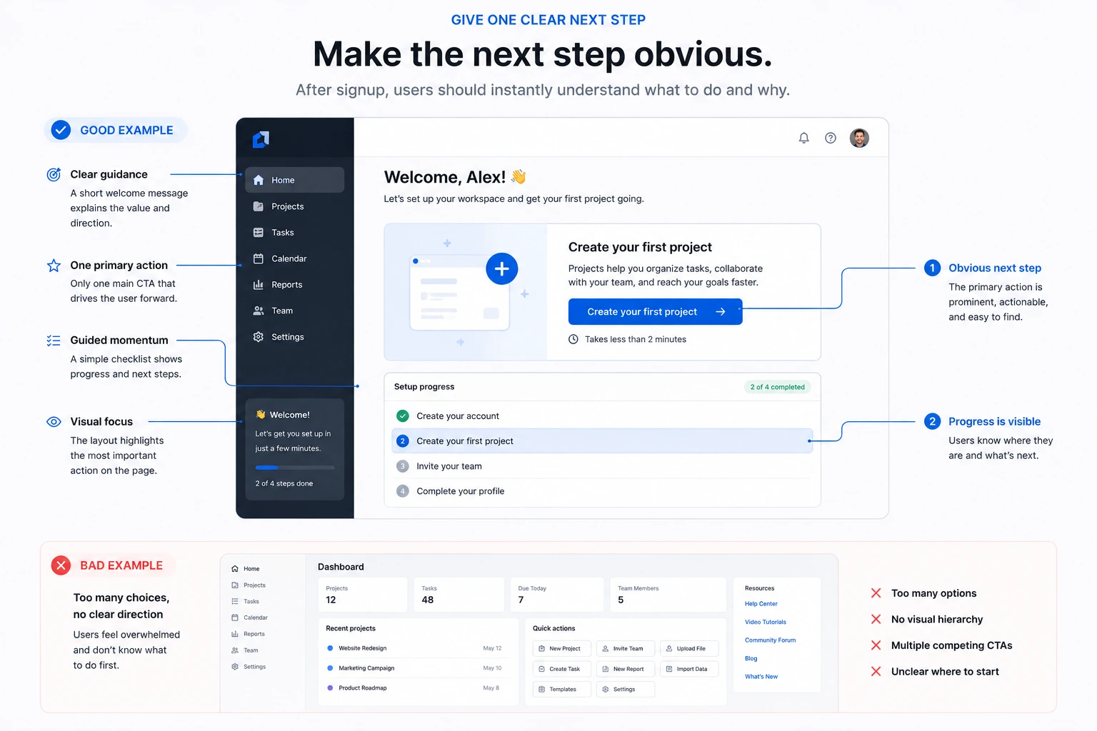
After signup, users should instantly understand:
“What should I do now?”
Good onboarding
- One main CTA → “Create your first project”
- One primary action → “Upload your first file”
- Visual focus → highlighted action button above everything else
- Guided momentum → step-by-step setup flow after signup
Bad onboarding
- Empty dashboards → user sees a blank screen with no guidance
- 20 menu items → too many navigation choices immediately
- Feature overload → showing advanced settings before basic usage
- Multiple competing CTAs → “Invite team”, “Upgrade”, “Create report”, “Watch tutorial” all at once
First Action Checklist
- There is one dominant next step
- The interface avoids overload
- Empty states explain what to do
- The CTA is visible immediately
- The user can start without reading documentation
Step 5 — Create Fast Wins
Users need immediate evidence that the product works.
Fast wins reduce abandonment.
Examples
| Product Type | Fast Win |
|---|---|
| AI Tool | Generate first useful response |
| CRM | Import first contact successfully |
| Fitness App | Complete first short workout |
| Finance App | See first spending graph automatically |
| Marketplace | Publish first listing in minutes |
Fast Win Checklist
- The user gets value within minutes
- Demo/sample content exists
- Templates reduce effort
- Blank states are avoided
- Users feel progress quickly
Step 6 — Use Progressive Disclosure
Do not explain everything immediately.
Users learn through action.
Reveal complexity gradually:
- beginner first
- advanced later
- contextual learning
- just-in-time explanations
Example
Instead of showing:
- analytics
- automations
- integrations
- advanced permissions
- exports
- API settings
Show only:
- the first action needed to succeed
Everything else appears progressively as the user advances.
Progressive Disclosure Checklist
- Advanced features are delayed
- Tutorials appear contextually
- Users learn while doing
- Tooltips are short and useful
- The UI feels manageable
Step 7 — Build Momentum with Progress Indicators
People finish onboarding when progress is visible.
Examples
- Progress bars → “Profile setup is 70% complete”
- Onboarding checklists → “Create account → Upload file → Invite team”
- Completion percentages → users know how much remains
- Milestone celebrations → small success message after completing a task
- Visual step indicators → “Step 2 of 4”
- Unlock systems → advanced features appear after initial setup
These systems reduce uncertainty and create psychological momentum.
Progress Checklist
- Users can see progress
- Remaining steps are clear
- The process feels finite
- Small completions feel rewarding
Step 8 — Design Good Empty States
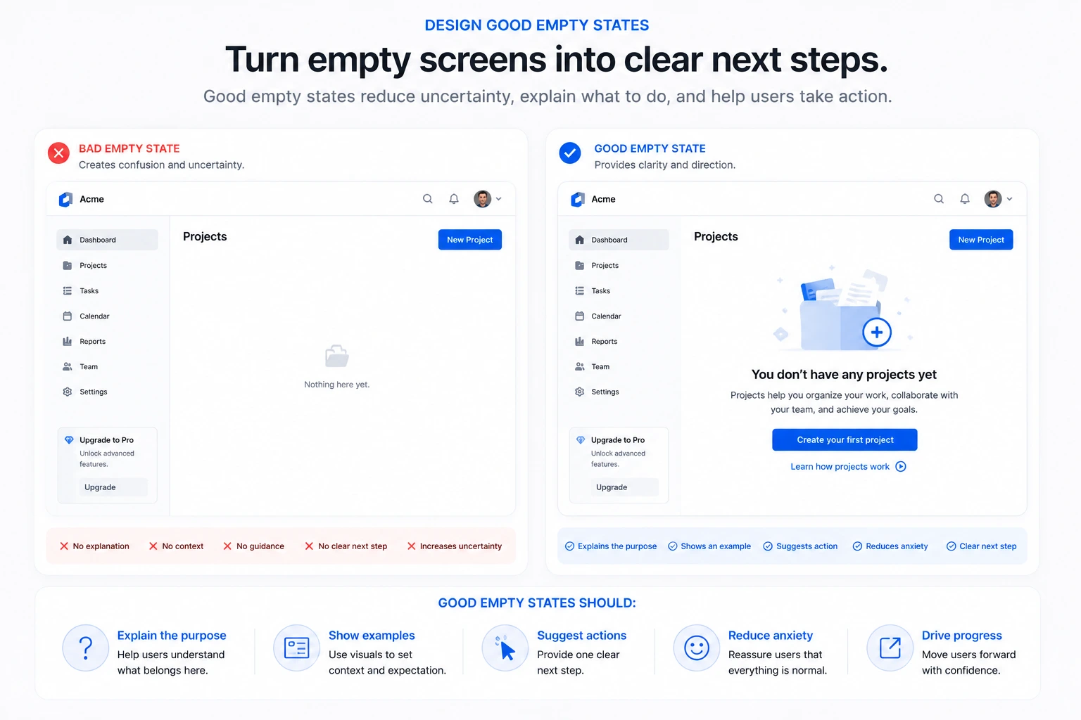
Empty screens create uncertainty.
Good empty states:
- Explain the purpose → “Projects you create will appear here”
- Show examples → preview cards or demo content
- Suggest actions → “Create your first campaign”
- Reduce anxiety → reassure users that nothing is broken
Bad empty state
- Completely blank dashboard
Better empty state
- Educational message + example + CTA button
Empty State Checklist
- Empty screens explain themselves
- There is a clear CTA
- Example content exists
- The user never feels “stuck”
Step 9 — Support Without Interrupting
Support should be accessible but not annoying.
Good support
- Searchable help center
- Short contextual tooltips
- Embedded tutorials
- FAQs close to actions
- Small onboarding videos
Bad support
- Aggressive popups
- Forced product tours
- Full-screen interruptions
- Repeated upgrade prompts
Support Checklist
- Help is accessible anytime
- Users can solve issues independently
- Explanations are concise
- Support appears contextually
Step 10 — Measure Activation, Not Just Signups
A signup means nothing if users never experience value.
Track:
- activation rate
- onboarding completion
- time to value
- retention
- drop-off points
Example metrics
| Metric | Example |
|---|---|
| Activation Rate | % users creating first project |
| Time to Value | Minutes until first successful action |
| Retention | Users returning after 7 days |
| Drop-off Point | Step where most users abandon |
| Feature Adoption | % users trying a core feature |
Analytics Checklist
- Activation events are tracked
- Funnel drop-offs are measured
- User sessions are reviewed
- Retention is analyzed
- Time-to-value is optimized
PART 3 — THE UNIVERSAL ONBOARDING AUDIT
Use this before launching any product.
Clarity
- Users understand the product quickly
- The next step is obvious
- Navigation is understandable
Friction
- Signup is fast
- Unnecessary steps are removed
- Mobile experience works well
Motivation
- Users experience progress quickly
- Early wins exist
- Momentum is maintained
Learning
- The product teaches progressively
- Tutorials are contextual
- Users are not overwhelmed
Retention
- The product creates habit loops
- Value is repeated consistently
- Users understand long-term benefits
PART 4 — PRODUCT-SPECIFIC ONBOARDING
SaaS
SaaS onboarding should focus on helping users become operational quickly.
Focus on:
- Setup simplicity → reduce technical setup and unnecessary configuration
- Integrations → connect email, CRM, Slack, Stripe, or external tools early
- First workflow completion → help users finish one meaningful task immediately
- Time-to-value → users should understand usefulness within minutes
- Guided setup → step-by-step onboarding instead of complex dashboards
Example
A project management tool should help users:
- Create a project
- Add tasks
- Invite teammates
- Complete one workflow
Marketplace
Marketplace onboarding should focus on trust and transaction readiness.
Focus on:
- Trust → reviews, verification badges, secure payments
- Listings → make publishing products/services extremely simple
- First transaction → help users buy or sell quickly
- Reducing friction → simplify uploads, pricing, and publishing
- Confidence → explain how payments, shipping, or protection work
Example
An Airbnb-style marketplace should guide hosts toward:
- Uploading photos
- Writing descriptions
- Setting pricing
- Publishing the listing
AI Products
AI onboarding should reduce intimidation and create immediate usefulness.
Focus on:
- First useful output → generate something valuable immediately
- Prompt examples → show users exactly what they can ask
- Reducing intimidation → avoid technical language initially
- Guided interaction → pre-made prompts and suggestions
- Fast experimentation → encourage trying multiple outputs quickly
Example
An AI writing assistant should:
- Show prompt examples
- Generate instant content
- Explain editing tools gradually
- Encourage iteration without pressure
Mobile Apps
Mobile onboarding should prioritize speed, simplicity, and habit creation.
Focus on:
- Speed → users should enter the product quickly
- Habit formation → encourage repeated usage patterns
- Notifications carefully → avoid requesting permissions immediately
- Thumb-friendly design → large buttons and minimal typing
- Short sessions → onboarding should work in under a few minutes
Example
A meditation app should:
- Ask the user’s goal
- Recommend one session
- Deliver immediate calm or relief
- Encourage daily repetition
B2B Platforms
B2B onboarding is usually more complex because multiple people are involved.
Focus on:
- Team setup → invite coworkers early
- Role permissions → simplify admin configuration
- Onboarding stakeholders → different onboarding for managers vs employees
- Data migration → importing previous systems smoothly
- Long-term adoption → reinforce workflows over time
Example
A CRM onboarding should help companies:
- Import contacts
- Configure pipelines
- Assign permissions
- Train teams progressively
- Create their first sales workflow
FINAL PRINCIPLE
The best onboarding does not feel like onboarding.
It feels like:
- momentum
- clarity
- confidence
- immediate usefulness
Good onboarding removes uncertainty until users naturally continue using the product on their own.
Suggested next step:
You could now create:
- a visual onboarding flow diagram
- a UX audit scorecard
- a Notion checklist template
- a “before launch” onboarding review system
- a library of good onboarding examples from real products